Advertisement
If Current Pattern Continues In Boston, This December May Be Warmest On Record
It was cold this weekend compared to the what we’ve enjoyed or perhaps cursed this month so far, but in actuality, this weekend’s temperatures were still just about average for the time of year.
Boston and many surrounding communities are on pace to have their warmest December on record. Records go back to the late 1800s.
Depending on just how warm it is next week and then right up to the new year, we could shatter the record for the warmest December set back in 2006.
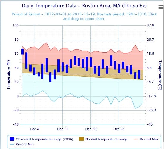
Let’s look at three charts to help illustrate just how warm it’s been this month.
The first chart below shows what temperatures were seen in 2006, the warmest December. Notice how many days in the middle of the month were in the red, much warmer than average.
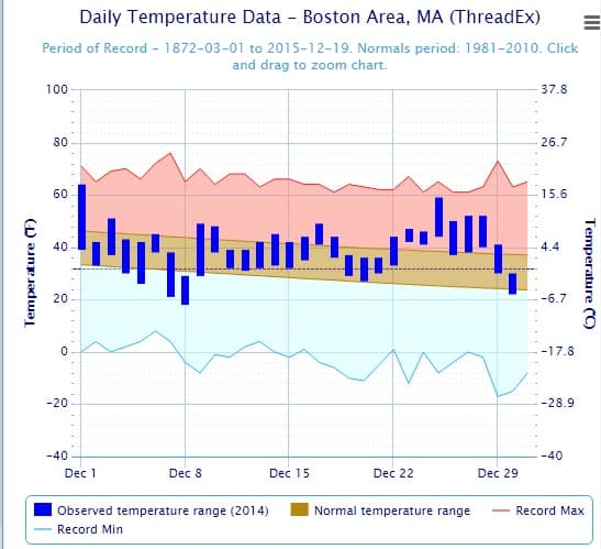
The second chart, seen below, gives us a look at highs last December — which was another warm month, but not quite a record-setter. You can see there were a handful of days colder than average, but most of the month was quite mild.
Now, let’s look at this month so far. What quickly becomes apparent is just how warm it has been nearly every day. Even Saturday, when it felt chilly, was 3 degrees above average.
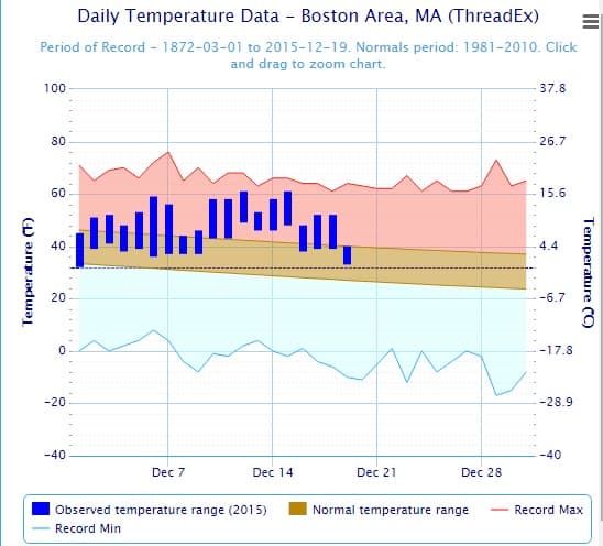
We’ll have to see how the next 10 days plays out, but with two-thirds of the month gone, it’s becoming increasingly likely this is going to be a record warm month. (For a closer look at the near future's weather, here is today's forecast.)
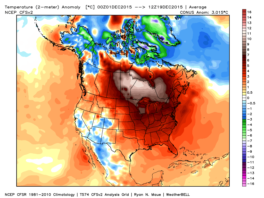
Finally, let me widen out the chart for you. The map below shows how much below or above average temperatures have been this month across North America.
The warmth is stunning as it reaches from northern Canada south to Florida. Much of this is due to El Nino, which has added a tremendous amount of heat to the global atmosphere this fall. Things will likely return to a more typical winter pattern as we get deeper into January, however.
You can follow my weather updates on Twitter at @growingwisdom.