Advertisement
Radiation In Japan Scary, Probably Not As Dangerous
Resume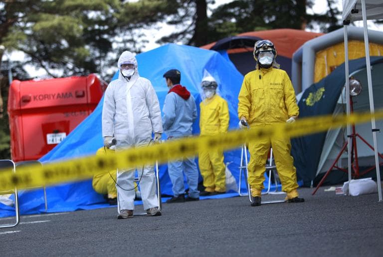
As scary news reports of radiation damage in Japan crawl all over our newspapers, televisions, computer screens and radios, viewers across the world are worried about a nuclear catastrophe.
But some people who actually know a thing or two about radiation and nuclear physics have been reacting with a different emotion — more of a cringe than a shiver. People like Ellen McManis, a student at Reed College in Portland, Ore., and a senior operator at her school's research reactor.
"No one has any context for these numbers which are coming in from Japan," McManis said. "I was listening to people saying, 'oh this is 20 times the normal level, this is 10 chest x-rays.' I got asked a question on the Internet one morning, 'is 20 microsieverts large?'"
McManis says Japan's Fukushima Dai-ichi nuclear power plant disaster is very serious, and we still don't know how bad it's going to get, but most of the radiation that's been observed in Northeast Japan and reported in the news is actually really, really tiny.
The average extra daily dose of radiation being measured in towns near Fukishima is less than half the normal background radiation.
Nevertheless, we're talking radiation here — a deadly airborne menace that you can't see or smell or touch, that's measured in units you don't understand. Any amount sounds like a lot. So, McManis turned to her friend Randall Munroe, a cartoonist with a physics degree who lives in Cambridge.
"She suggested that there needed to be a chart or something, showing people what different radiation levels meant," Munroe said.
Easy, right? Not so much. It turned out to be a surprising challenge.
"I start just saying, 'ok what's the smallest thing I can plot,' and I made a little dot for that, and I said, 'ok now what are some larger doses of radiation people would get,' and I would make them proportionally larger," Munroe said. "Pretty quickly I found that it got much too big to fit on the chart."
On the small end of that scale, you have something Munroe calls a "banana dose."
"Bananas have potassium in them, which gives you a little bit of radiation when you eat it. And it's so tiny, but it's still a measurable amount of radiation," Munroe said. "Then, way up at the other end of the scale is Chernobyl if you were standing next to the reactor when it went."
To visualize the vast orders of magnitude across that scale, Randall came up with an incredibly elegant chart. In one box, he has a bunch of little dots representing the amount of radiation given off by some common things.
"You get about .05 microsieverts, which is one dot on the chart, by just sleeping next to someone for a night because our bodies emit natural radiation," Munroe said.
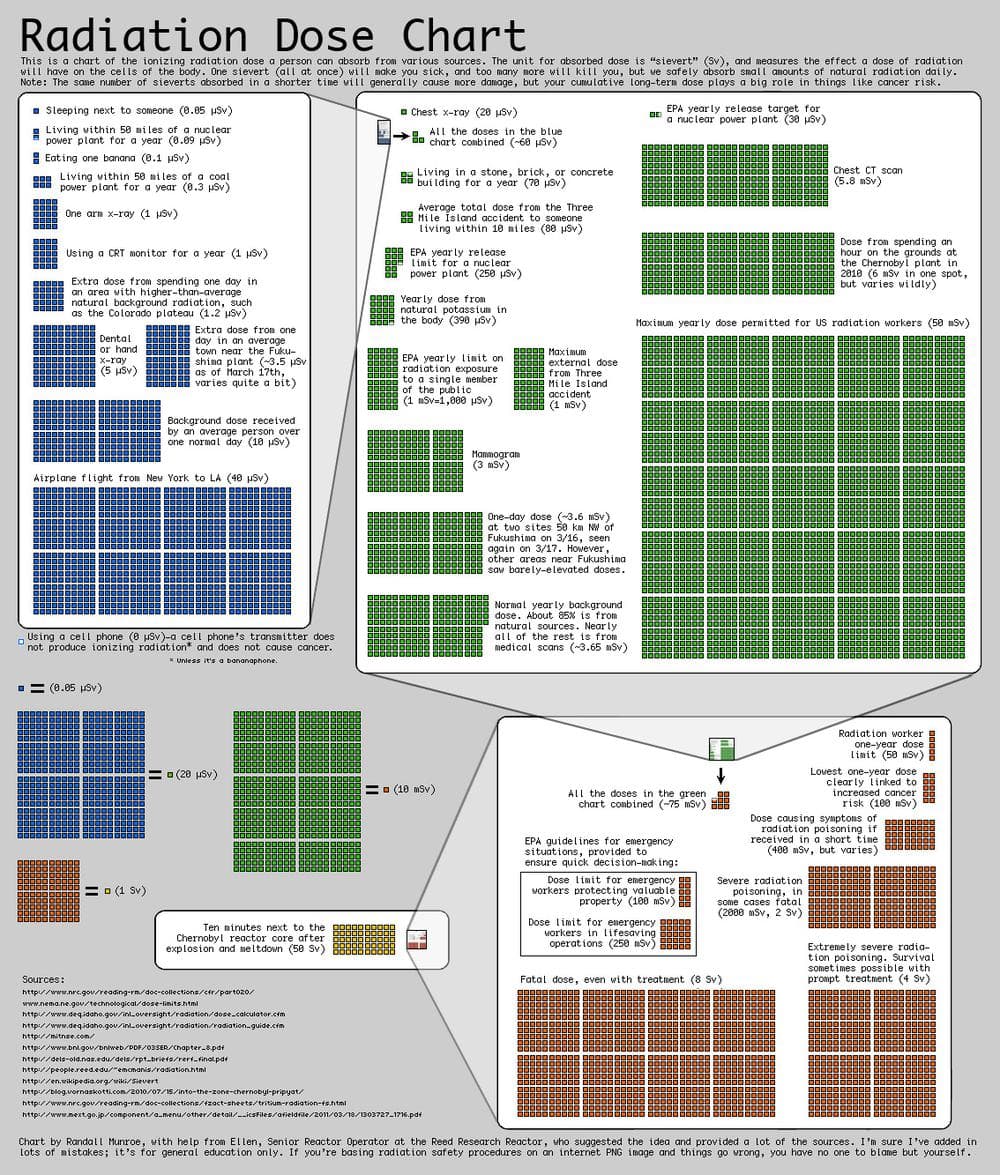
That little dot is dwarfed by the cluster of 70 dots representing the average extra daily dose of radiation that's being measured now in towns near the Fukishima plant in Japan. "And both of those are dwarfed by the background dose that you get anywhere in a day, which is about 10 microsieverts," Munroe said.
That's about 200 dots on the chart. Sounds like a lot, sure, but that's not really so.
"All of those doses total up to the extra radiation you get if you happen to live in a stone or a brick house," Munroe said.
And how much radiation is that? Well, it's about 1/12 of the highest doses of radiation recorded in the area around Three Mile Island during the accident there.
"That, in turn — the worst of Three Mile Island — is about a third of a mammogram's worth of radiation," Munroe said. "The biggest thing on that section of the chart is the yearly dose permitted to radiation workers."
What does it all mean? If you got the maximum dose that you're permitted to get in any one year, along with a mammogram, a CT scan, a chest x-ray, plus you were near Three Mile Island and lived in a stone or brick house located near the Japanese reactor you'd still get less than 100 millisieverts.
That 100 millisieverts is the "lowest dose that's clearly linked to an increased risk of cancer," Munroe said. "There's a chance that a little bit smaller doses than that are linked to cancer, but the data is just a little bit fuzzy."
The bottom line, of course, is that this can all get a little bit confusing.
"I think what we take away from this is that we don't have a good intuitive understanding of radiation and it's easy for us to become spooked," McManis said.
"I think what we take away from this is that we don't have a good intuitive understanding of radiation and it's easy for us to become spooked."
Ellen McManis
Considering that so few of us deal with these terms every day, radiation levels are hard to understand.
"It's difficult for reporting in the media to convey an accurate picture to readers, listeners, or viewers as to exactly how bad something is, and that's why charts like these help," McManis said.
If the take-away from Munroe's chart is that the nuclear risks in Japan aren't actually that great, is Munroe pro-nuclear power?
"Well, I don't want to minimize the storage problem, what to do with our nuclear waste long term," Munroe said, "but I feel like that is an easier problem to solve than the problems inherent to coal and oil."
McManis, who works with nuclear power, agrees.
"I'm in favor of nuclear power in as much as it'll help us reduce our dependence on fossil fuels, but it is certainly not the answer, and we certainly need to keep developing and pushing truly renewable technologies in order to have a good sustainable future on this planet," she said.
Munroe and McManis stress that the visualization is for general education only. We ran it by some experts at MIT who told us the figures check out, though it's worth noting that Munroe is mixing some cumulative doses with immediate doses.
Still, our experts stressed that while this little intellectual exercise is useful, we still have no idea what's going to happen at Fukishima. There could be effects from long-term exposure that we can't as yet foresee.
For now, though, we can understand the immediate risks a little bit better.
This segment aired on March 22, 2011.