Support WBUR
What Color Is Your City?
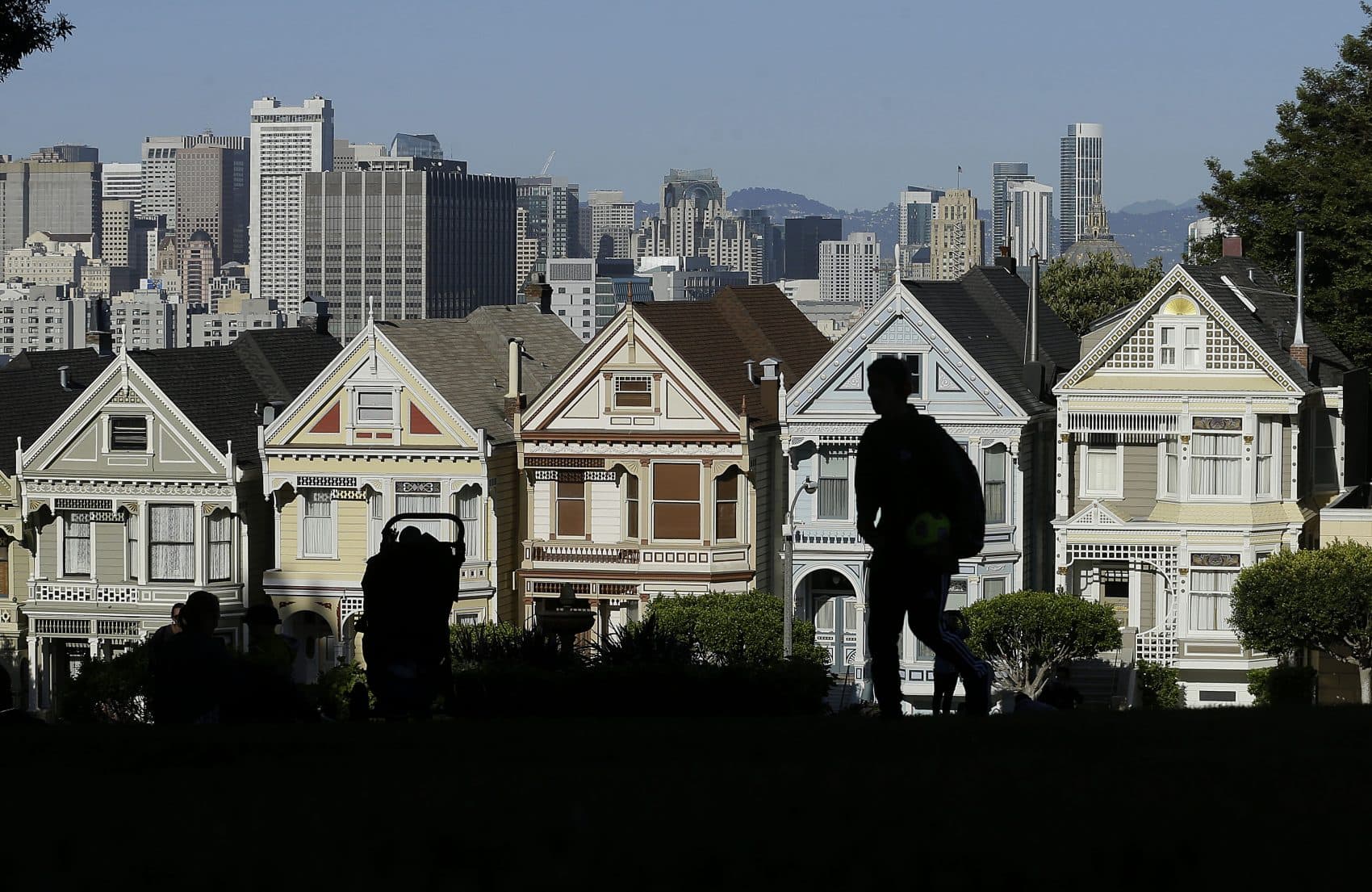
Close your eyes and think of San Francisco. What colors do you see? Maybe the bold red of the Golden Gate Bridge, or the pastels of the Victorian mansions known as the "Painted Ladies." What about New York? Maybe the gray and brown of pavement and brick, with a pop of yellow from taxis.
Here & Now's Jeremy Hobson looks at how a city's color palette comes to be, and how it impacts the people who live there, with Laurie Pressman of the Pantone Color Institute.
Interview Highlights
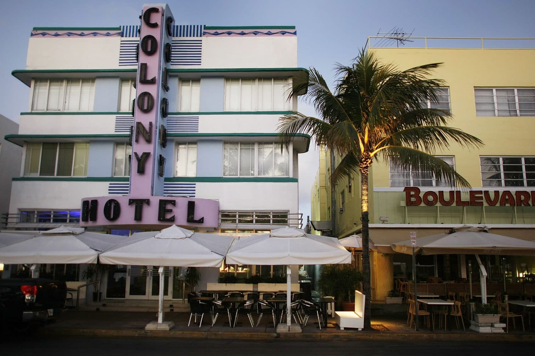
On the color palette in cities like Washington, D.C., Boston and Miami Beach
"You've definitely brought up a great cross section there, and you're almost crossing, not just three different climates, but three different cultures. So when you think about Miami Beach, and you think about — especially over the last 20 years — first of all, you're looking at a very warm climate, so of course white makes perfect sense for something like that. But, over the last — and it's probably more than 20 years at this point, I would say 50 years — the influx of the Hispanic community, so whether you're looking at people coming in from Puerto Rico, or you're looking at people coming in from Cuba, if you're looking at South America. So I think with a whole different culture coming in, you're also looking at a changing color palette."
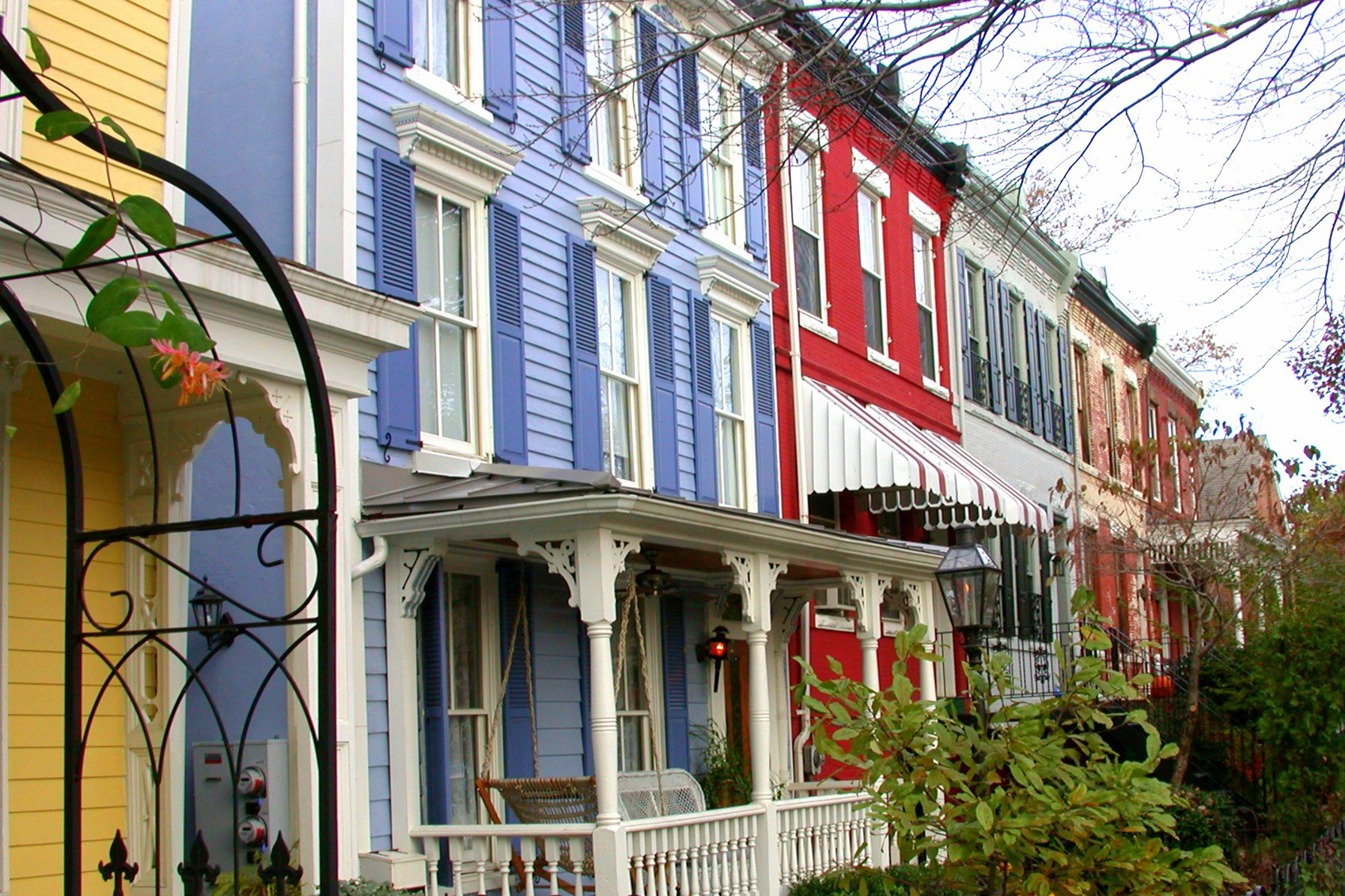
"I think of Washington, D.C. as a really interesting dichotomy. It's a city that bridges... you have this whole conservative thing, because of the political culture. But you also have a city that straddles the North and straddles the South, and when I think of the brighter colors there, I think of some of that southern personality coming through a little bit more, that warmer climate. And then you look at New England, and you think of New England as almost one of the original areas of this great country, and the brick, and the Federalist look, it makes perfect sense."

On other examples of cities that have a distinct color palette
"I think one of the most interesting cities to me, when I think about this country, is San Francisco, and I think about that because when you think of San Francisco, we associate that city with being very culturally progressive. So you expect that freedom of expression, and you also look at a climate that is, you know, kind of warm — it's not LA, for sure, but it's definitely warmer than some of the Northeast cities. But what strikes me there is the 'Painted Ladies,' because you think of those old Victorian houses that were built so many different years ago, and you think of how, I guess in the late-'70s, they got this name. People were using color as a way to accentuate the individual architectural details on the house, because if you look at these houses, they all look the same, and yet here now, if you go down to that row and take a look at those houses, it's such a beautiful expression — not just of color, but really of what that city is all about. So that's always the first thing that comes to mind when I think of color in a particular city."
On whether there's an exterior color that is currently in vogue
"I go back to the grays, because if you're looking at exterior colors, you have to keep in mind it's not a color that somebody's going to change that often. Typically, what we would advise people is to really stay within the personality of the house. So if you were looking at a craftsman house, for example, you may not want to be thinking about turquoise and white, it just may not work. You might be better off staying with burnt oranges or a brown-based red or something like that, that just fits with the overall feeling of the house. So to us, I would say cohesion is really the big thing. But if I had to look at a color, it's the contrast with white, but it's definitely the grays, because that is a color that can go the distance — it's gonna look stately, it could look traditional yet chic at the same time. And if you wanted to really change, maybe you add a little bit of brighter color to the door, or to the trim of the home. But once you're looking at exteriors, I think you really need something — I use that phrase again — that's gonna go the distance, and maintain the integrity of the home."
This article was originally published on March 27, 2017.
This segment aired on March 27, 2017.