Support WBUR
Mapping The Ever-Shifting Mass. Hospital Landscape
Thanks to health policy guru John McDonough for highlighting the Blue Cross Blue Shield of Massachusetts' new Health Care Delivery System Map which offers a snapshot of the state's medical industrial complex as it becomes increasingly concentrated. There's great data here, and it's fairly easy to sort, from hospital revenue, ownership and geography to the latest info on mergers, acquisitions and new partnerships.
For example, if you want to begin to understand why Partners Healthcare is so dominant in the state's healthcare market, don't go to this page, Hospital Systems by Size, on which Partners is #2 after Steward Health Care System. Go this this page: Physician Networks and Major Medical Groups, where the size of Partners' physician network (called Partners Community Healthcare Inc., PCHI, or "peachy") is larger than #2 (Steward) or #3 (Atrius), combined.
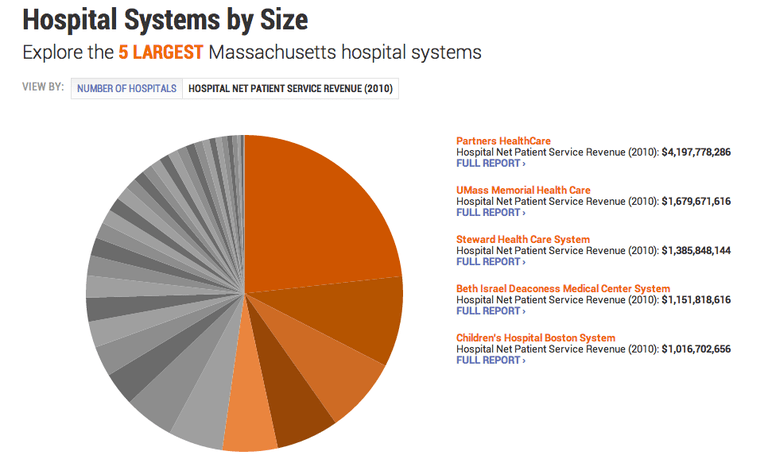
Or look at hospitals by Net Patient Service Revenue, and see that Partners total NPSR in 2010 ($4.2 billion) was the same as #s 2 (UMass Memorial), 3 (Steward), and 4 (Beth Israel Deaconess) combined.
Don't forget this helpful page of Recent Changes in the Massachusetts health care market.
Readers, please roam around the site and let us know what's interesting or useful to you.
This program aired on May 20, 2013. The audio for this program is not available.