Support WBUR
Bob Staake, The Cape Cod Artist Behind The New Yorker’s Iconic Ferguson Cover
Everyone’s talking about Bob Staake’s cover for this week’s edition of The New Yorker magazine. Published in response to a grand jury’s decision last week not to indict a white police officer for fatally shooting unarmed black teenager Michael Brown in Ferguson, Missouri, in August, the cover imagines St. Louis’s iconic Gateway Arch broken in two. The two sides angle up from a city skyline that is divided into black and white, divided by race into communities that reach toward each other, but can’t connect.
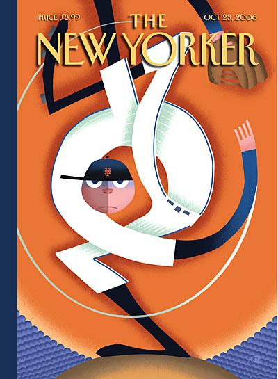
The Chatham-based illustrator is best known for lighter fare—streamlined, jaunty, witty kids books and New Yorker covers, designed in computer, that joke about Santa Claus or baseball pitchers or what’s on kids' minds. But he’s also the artist responsible for some of the most iconic New Yorker covers of the Obama era—to mark Barack Obama first winning the presidency in 2008, he turned the O in The New Yorker and Obama into a full moon over the Lincoln Memorial; to mark Obama’s endorsement of same-sex marriage in 2012, he reimagined the columns of the White House in the rainbow hues of the gay pride flag. Staake’s covers are elegiac visual monuments to historic moments.
Staake’s Ferguson “Broken Arch” cover, like these others, speaks of the state of civil rights in America. Much imagery from Ferguson has illustrated the killing itself, the subsequent protests, and police crackdown. In the interview below, Staake speaks about how his cover takes a step back, addressing the controversy symbolically, in a way that begins to move beyond the contested specifics of Ferguson to facts about how race and racism continue to divide our whole nation.
Staake: “That cover is informed from my 17 years of living in St. Louis, where it really is a divided city. It is a white-black city. … There’s an awful lot of segregation that goes on.”
Staake: “If you’re going to do an iconic cover about the events of Ferguson in terms of St. Louis, it’s the view of the arch. At that point, how do I go ahead and alter the arch in such a way that it makes a statement?”
Staake: “This is a really unique news event in that you didn’t know when the grand jury was going to come down with a verdict. We didn’t know if it was going to be tomorrow, if it was going to be a week from tomorrow, if it was going to be three weeks from tomorrow. After looking at the entire issue, I thought, well, if there’s no indictment, this is what I would do. And I remember sitting on the couch with my wife, we were watching CNN or something, and they were talking about the potential for the verdict, and I said, ‘Ya know what I would do,’ and I explained it to her. I would just simply go ahead and do the arch from the East St. Louis side of the river, looking across, divide the arch into white city on the left, black city on the right, and a break at the top of the arch. She wasn’t quite getting it. So I said it’s just the type of thing that I had to do. A lot of my covers I will go ahead and just go directly to finish, there won’t be a sketch or anything. That’s what I did in this case. I went out to the studio and created the art and submitted it to The New Yorker and said, ‘This hasn’t happened yet, but if it does go this way, I think this is an important cover.’ So once the no-verdict verdict came out, then it all made sense.”
Staake: “I lived in St. Louis for 17 years. Some of the attitudes of some people within the city I was absolutely appalled with. It’s one thing to visit a city. It’s another thing to live in a city. I haven’t lived in Cincinnati. I haven’t lived in Laramie, Wyoming. Maybe there are racial attitudes and homophobic and sexist attitudes in those cities that would just make me cringe as well, but I haven’t lived in those cities.”
Staake: “This is coming from Los Angeles [where Staake grew up]. I’m not talking about the city [of St. Louis]. I’m talking about the attitude of some white people within the city. I heard very, very racist things being said. In my neighborhood, my next-door neighbor, and he was an old guy with one leg, but I remember him talking about how did I realize some the N-word had moved in down the street. I was just appalled. I couldn’t believe it. It’s like, OK, well, you know. Then I remember one time where my studio was there was a really nice guy and he started railing on about blacks and he went into this whole diatribe and he said, ‘Well, I’m a racist, I admit it.’ It was unbelievable to me that you would hear people saying this stuff in that city—and, again, maybe they say it in other places too—with absolutely no filter whatsoever.”
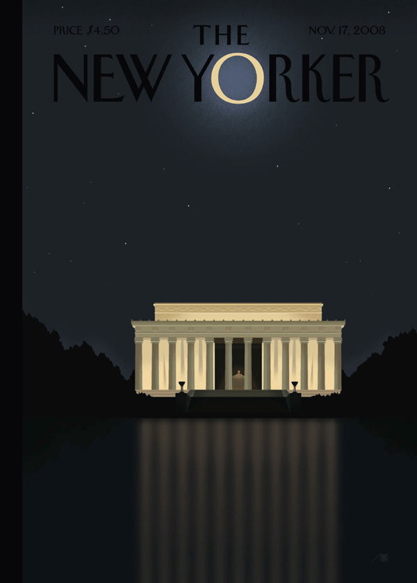
Staake: “I try to find a way to really, really boil down and distill a big, complex issue into the most simple image that I possibly can. The simpler the better. And it’s difficult to do. I can sometimes for a New Yorker cover have as many as 10, 15 different sketches. That Obama victory cover I had about 12 sketches before I finally landed on the one with the O in the masthead and the Lincoln Memorial and the reflection. The moment I came up with the idea, I knew that would be the cover.”
Staake on his Nov. 17, 2008, New Yorker cover: “[New Yorker Art Editor] Francoise [Mouly] called me up saying, 'Do you have any ideas for Obama’s victory?' I hadn’t even bothered thinking about it because I thought they would have had something in the can for a while. I said, ‘Let me think about it.’ So in an hour I went ahead and probably came up with about 10, 12 different ideas, all sketches, all different. One of the advantages I have is I can come at an issue from 12 different directions. That’s part of the process for me to flesh out what’s going to work and what isn’t. I kept submitting these. And I was getting closer and closer. Then I started thinking about iconography and that’s when I thought that there’s no other piece of architecture in Washington that’s more representative of black struggle than the Lincoln Memorial. So by having that ubiquitous O in the New Yorker’s logo as the moon—that was at a time when we had a full moon every single night. There was just this incredible moon. I’d come out of my studio and look at it every night. So the moon above, the Lincoln Memorial representing the Emancipation Proclamation, and then the reflection of the columns on the water representing the bars of slavery. So it just all came full circle. When I came up with the sketch, she called me back five minutes later and said, ‘OK, that’s the cover. You’ve got to 9 in the morning to get it to us.’”
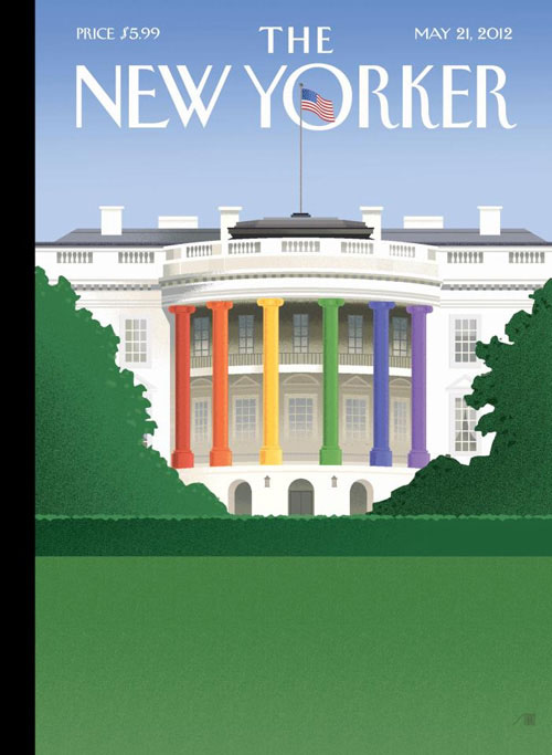
Staake on his May 21, 2012, New Yorker cover: “We were in New York. I was giving a talk with [New Yorker Editor] David Remnick, Francoise Mouly and [illustrator] Barry Blitt about New Yorker covers, and on the drive home heard on the radio that [Vice President Joe] Biden has come out saying he was all for same-sex unions. So he opens his big mouth and forces Obama’s hand. Then Obama goes ahead and he comes out with a statement that was basically he had no problem with it. So it was in the car. It’s always amazing where these ideas come from.”
Staake: “So many of my most popular New Yorker covers do utilize architecture to make a point—my Obama victory cover with the Lincoln Memorial or the gay union cover with the White House with the rainbow columns. I use established architectural iconography to go ahead and make a point. But most important to me—and certainly that’s the case with this ‘Broken Arch’ cover—is I want to go ahead and present imagery and elements in an almost enigmatic way, in an abstracted way that really demands a reader to go ahead and flesh it out. It’s remarkable to me how many different interpretations one can have of this one cover. Some people, they find it heartbreaking, it makes them cry. Other people, they say, ‘That’s not how it is.’ This is a wonderful thing when a single piece of art with just color and form and a very, very simple cover design, it can engender that sort of a dialogue.”
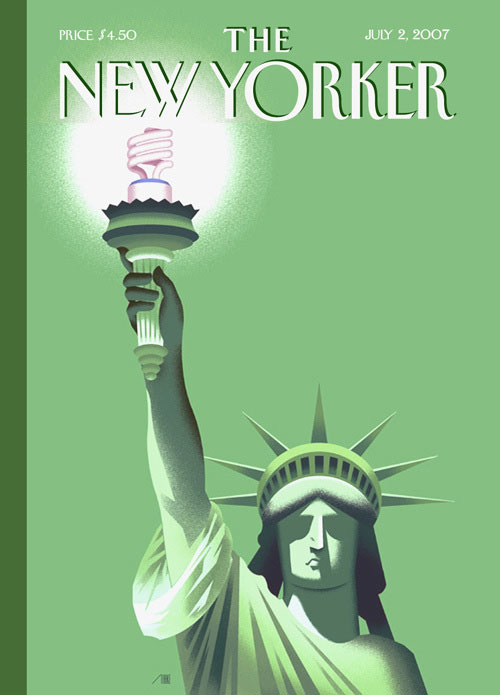
Staake: “You know what that Lincoln Memorial represents. You know what the Gateway Arch represents—it is a gateway. So all of a sudden, you start thinking in terms of St. Louis and the events in St. Louis as being a gateway to the next level, where do we go from here. I’ve used the Statue of Liberty—instead of holding up the torch, it’s a CFL light bulb, but that’s liberty, that’s independence. It’s interesting to me how these ideas are really reliant on the well established information about those monuments that I’m using.”
Staake: “I think a good New Yorker cover should have a shelf life of like a week. It’s a response to whatever is going in the country at that time and those words are important at that time, at that moment. I want to create a cover that speaks to this moment in time. It wasn’t viable three months ago, it’s not going to be viable three months in the future, but it speaks to this moment right now. Sometimes you do something silly, sometimes you do something humorous, sometimes you do something subtle. I wish I had a dime for every New Yorker cover of mine that has been killed on the table, that just didn’t make it. I think we all would feel that way. Somehow they really kind of tap into that moment of our existence right now and what’s going on in America. What I would strive for, I want to welcome in the viewer. I basically am telling them, look, I’m not going to give you the entire story in this cover because I know you’re intelligent enough to go ahead and decipher this imagery. And when you do, you’ll make it your own, you’ll feel as if you’re discovering this statement that is like, ‘Yeah, that’s exactly the way I feel.’ Or ‘I don’t feel this way at all,” and it’s going to irritate you and you’re going to reevaluate your position.”
Greg Cook is co-founder of WBUR’s ARTery. Be his friend on Twitter @AestheticResear and on the Facebook.
This article was originally published on December 02, 2014.