Support WBUR
'Atlas Of Inequality' Shows Income Segregation Around Boston
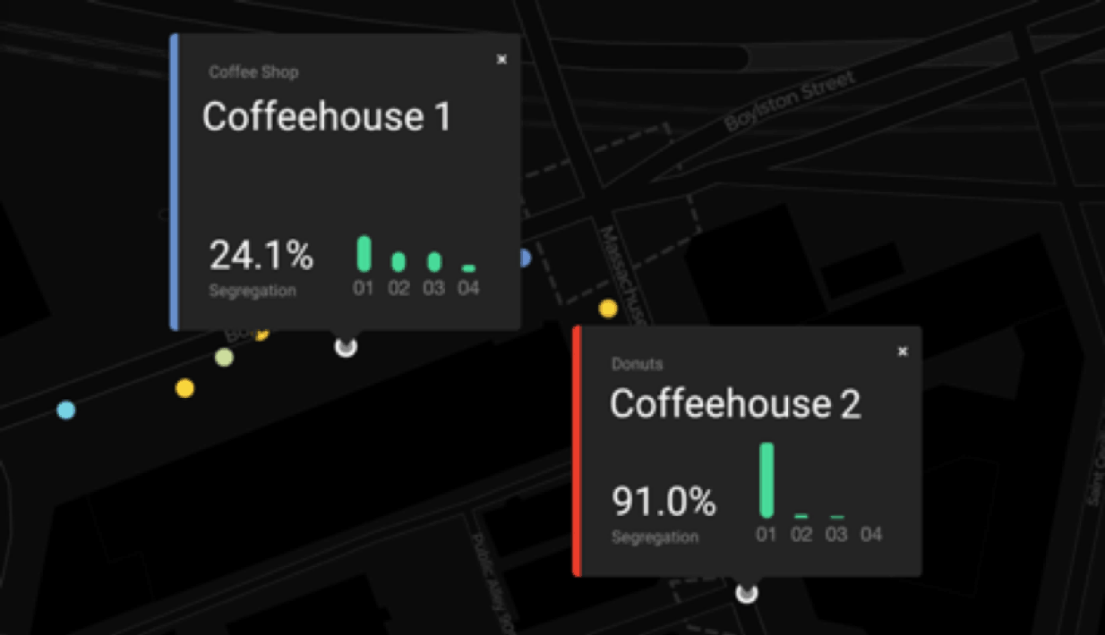
At one coffeshop in Boston, near Hynes Convention Center, visitors come from a variety of income levels. But at a second coffeehouse, a mere 2-minute walk away, people are almost exclusively from the metro area's lowest income bracket.
The stark divergence is highlighted by researchers behind a new MIT Media Lab project that shows income inequality is about more than just where people live; it's also about where they shop, eat and spend their free time.
"Although we may get our daily coffee on the same city block, the specific places we're in — and the people around us — can be radically different," the researchers write on the Atlas of Inequality website.
"We want to raise the point that segregation is happening at very short [distances], like even just 25 meters, just across the street," said Esteban Moro, of MIT and the University Carlos III of Madrid, and one of the initiative's principal investigators.
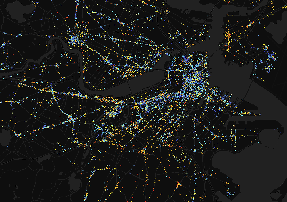
The project uses aggregated, anonymized data to determine visitors at thousands of locations — like restaurants, schools and parks — in the Boston metro area.
The end result is a colorful interactive map — with blue dots showing places where you could expect to find people of different incomes, and red dots showing locations that are relatively homogeneous.
Boston Common, perhaps appropriately, is one such blue dot, with low "place inequality."
Like many other major American metro areas, Boston has been wrestling with wide income inequality among residents.
One report finds Boston is the seventh-most income-unequal big city in the country. Another calculates that Boston has added tens of thousands of low- and high-income households over 25 years, while losing middle-income residents. Still other data has found increasing income segregation in the metro area.
Here's how the researchers put together the unique map:
-- They analyzed the mobility patterns of about 150,000 anonymous users from October 2016 to March 2017, based on their digital devices. The MIT team then paired that data with a list of 30,000 locations that people visit around Boston. If a user spent at least five minutes at one of those locations, it constituted a "visit."
-- Then, to get the income data, researchers determined the census block where a user spent most of their overnight hours — thinking that meant a user lived there — and assigned to that user the median household income for that area. The tens of thousands of users in the dataset were then clustered into four income brackets.
-- "Then," the MIT team writes, "we compute the total time each income group spends in each place in our dataset. The end result is a chart for each place that shows how likely you are to see people from each income quartile if you visit."
The researchers concede there are some limitations to the data. A transient person, for instance, may not have had a consistent overnight location over the six months.
Additionally, the researchers note that income inequality is not the same as class or wealth inequality. They write: "Income is also known to be an imperfect proxy for class; many highly wealthy households have little annual income."
The Media Lab team began its work with this Boston-area map. The researchers hope to produce other maps for several other metro areas across the U.S.