Support WBUR
Extreme Decorating And Design At The MFA

If you’ve ever decorated a room or remodeled a house you know how overwhelming design decisions can be: paint colors, fabrics, fixtures. Now imagine designing a 50,000-square foot museum wing, with 53 new galleries, that will ultimately display 5,000 works of art.
Welcome to Malcolm Rogers' world. He directs the Museum of Fine Arts and has influenced every design detail in the MFA’s new Art of the Americas wing, which opens to the public in November.
"The museum, you know, is my place.”
MFA Director Malcolm Rogers
The museum’s expansion is massive compared to most houses, and Rogers says decorating 53 galleries is nothing like decorating your living room. "Each gallery is like a theater in which the museum will be creating a production,” he said, “and that you can’t do every gallery the same, it would be terribly, terribly, terribly monotonous.”
So gallery by gallery, Rogers and his team have designed atmospheres and “vignettes” that help tell stories about the museum’s holdings. Some really do look like stage sets, especially in the Colonial Boston gallery with its antique furniture and Paul Revere's Liberty Bowl. It's clear from the spark in Rogers' eyes that this process is personal.
Sitting in his new corner office overlooking the Fenway, he said, ”The museum, you know, is my place.” And designing “his place” has come with enough decisions to make anyone’s head spin.
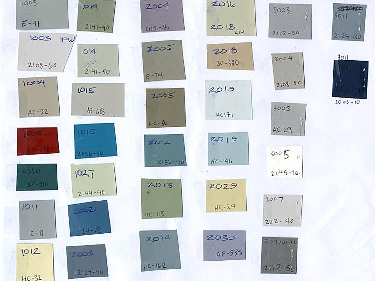
”You can’t imagine how many paint swatches I have seen over the last few years!” Rogers said. And he’s not kidding. He’s seen hundreds. Now about 60 paint colors can be found in the new wing. There's wallpaper, too. And lighting, flooring, glass display cases — plus the placement of the artworks themselves.
Rogers says no one person could handle making all of the decisions on their own. “It's been the greatest fun,” he exclaimed, quite happily. “I've got so excited working with the curators and tweaking things a little. Sometimes I'm wrong and get argued out, and sometimes I'm right, but the more people who discuss something, the better the solution, I think.”
But more often than not the solution has Rogers' fingerprints all over it. Two people he constantly discusses ideas with are Art of the Americas curator Elliot Davis and the MFA’s head of design, Keith Crippen. They are the triumvirate behind the new wing’s aesthetic, and sometimes they run up against some friendly, creative conflict.
Take for instance the discussions over what to cover the walls with in the John Singer Sargent gallery. Rogers wanted a rich, patterned Damask made of fabric. Davis and Crippen didn’t.

"I think originally we always wanted to use a pattern up there but we thought to use such a traditional Damask pattern would’ve contrasted too much with the contemporary architecture,” Crippen said.
But in the end they all admit Rogers was right. Davis says the three of them are always triangulating options. Figuring things out can be an exercise in flexibility, and it’s rarely worth going to the mat when they don’t see eye to eye.
“You know, unless it’s really detrimental to the works of art, that’s where the curators are coming from," she said. "Maybe Keith is coming from the point of view of, is it really detrimental to the overall design that you’re looking for? And Malcolm, being the director, has to put a stamp, he has to ultimately live with it.”
And, even though the team went with Rogers' Damask in the Sargent gallery, the museum director says he always worries about balance. Wallpaper and wall paint cannot overshadow the art because the art comes first. This fundamental principle guides Rogers' vision for the new wing.
“I and my trustees have a passion to see objects in all media together," he said. "Paintings talking to sculpture talking to furniture talking to other decorative arts. So often what I'm looking at when I go in the galleries is how does everything in here work as a whole? Does it seem harmonious, is there a rhythm?”
Overall the director, designer and curator are extremely satisfied with their choices — maybe even delighted — especially the deep green teal paint on the walls in the Copley gallery. But Crippen admits all this picking and choosing can be exhausting. "You know, when I go home I let my wife pick the paint colors,” he said with a big laugh.
At this point, though, all the major design decisions have been made. Now Rogers says they’ll spend the final weeks tweaking the final placement of more than 5,000 pieces of art.
“I think one area where, um, I suppose I’ve been a little more dominant, but there are very few instances, is in the wing there is a tremendous profusion of objects,” he admitted, “there are lots of things, I have occasionally said there’s too much, we need to remove one or two pieces.”
Rogers evoked one of Coco Channel’s famous fashion tactics.
“It’s like the rule about jewelry: put on all the jewelry you think you need for a big dinner party and then take one piece off,” he said, laughing.
For the museum director harmony is a matter of proportions — even in a new 50,000-square foot museum wing with a multi-million dollar price tag.
More:
This program aired on October 11, 2010.
