Support WBUR
Arriving At Boston Public Schools: More Accurate — And Inclusive — World Maps
Picture a wall-size world map. What do you see?
What you are imagining is most likely not the type of map going into Boston Public Schools Thursday.
Social studies teachers in the second, seventh and 11th grades in Boston schools will now have Peters projection maps to use in their classrooms.
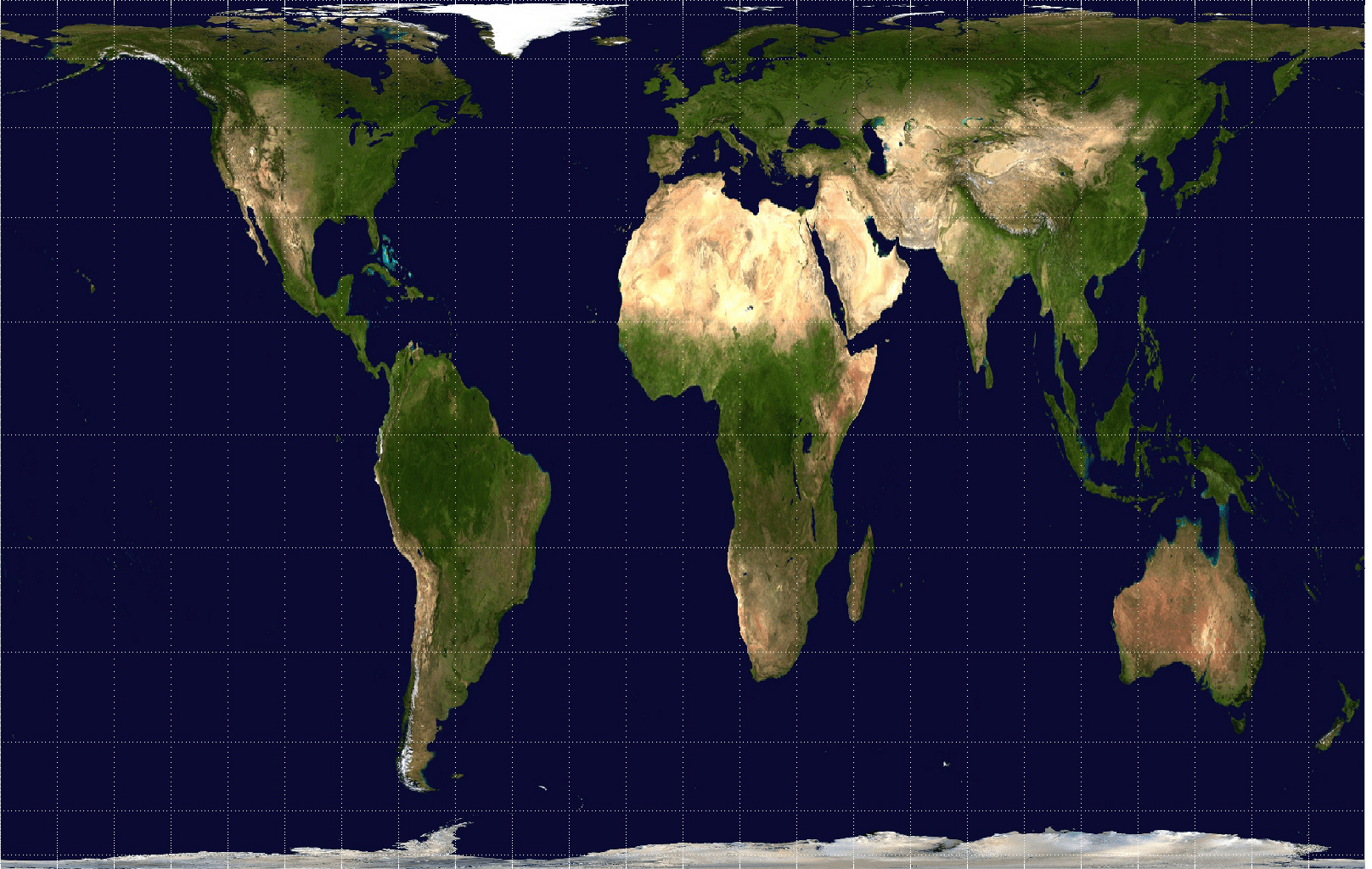
The Peters projection map, also referred to as the Gall-Peters projection map, is considered an equal-area representation of the globe and was created as we know it in 1974. On the map, the land masses of Earth's continents accurately reflect their true proportions. For example: Africa is bigger than North America and South America is bigger than Europe. You know, as they are in real life.
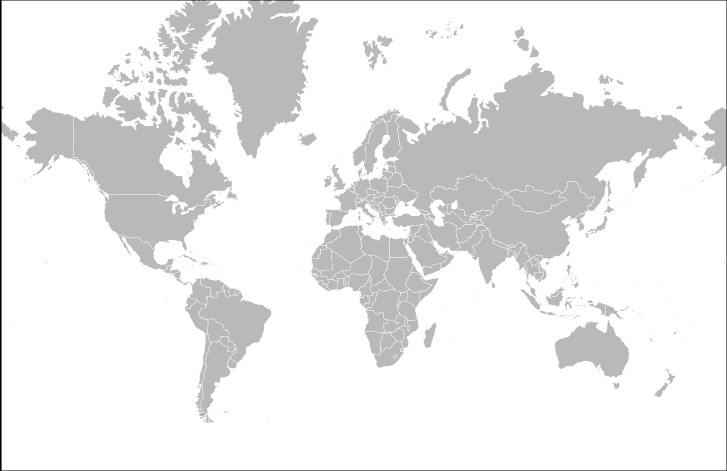
This is vastly different from the "traditional" map you picture in your head when you think of world maps — that version is the Mercator Projection map.
The Mercator map was created in 1569 to make colonial trade routes easier to navigate. In creating a map that prioritized straight lines of travel, land masses of continents became distorted.
For BPS officials, that distortion no longer holds up in 21st-century Boston.
The district says it is providing the Peters map to teachers and students as one way to "de-colonize" curriculum and to make sure students of color don't feel as if they are being sidelined.
"Eighty-six percent of our students are students of color," says Hayden Frederick-Clarke, director of cultural proficiency for BPS. "Maps that they are presented with generally classify the places that they're from as small and insignificant. It only seems right that we would present them with an accurate view of themselves."
Frederick-Clarke says the last thing BPS wants students to think is that they are intentionally being deceived.
"Once students feel like the school isn't being truthful, there's a tendency to shut down and reject information," Frederick-Clarke says.
Frederick-Clarke notes that some of the inaccuracies of the ubiquitous Mercator map are hard to overlook: Greenland is shown to be roughly the size of Africa (in reality it's 14 times smaller) and Germany is about at the center of the map (it's really a lot farther north on the globe than you might think).
Natacha Scott, BPS history and social studies director, says having a new map in the classroom will allow students to question previously held assumptions that colonial-era maps are still relevant today.
"Traditionally, they've only know the Mercator map, so they don't have anything to question against that narrative," Scott says. "But here, providing this equal-area map, really provides that opportunity to question and wonder because, otherwise, if you're just looking at the same traditional map — you're not thinking about that."
The battle between the commonplace Mercator map and the more accurate Peters map is not a new topic to try to hash out. It made its way all the way to the White House. At least, it did in "The West Wing."

While no map can perfectly show Earth as it is — it's hard to map a three-dimensional shape using just two dimensions — Colin Rose says the point is to provide students with more accurate and inclusive views of the world. He's the assistant superintendent of opportunity and achievement gaps.
"It's a conversation starter with students," Rose says, "where they can look at the current projections that are used in the Mercator map and be able to start thinking critically about the materials that are in front of them and a jump-off point as to why certain materials are used and why certain materials are not used."
Updated to clarify the wording of which continents are larger than others.
This article was originally published on March 16, 2017.